Mercator projection
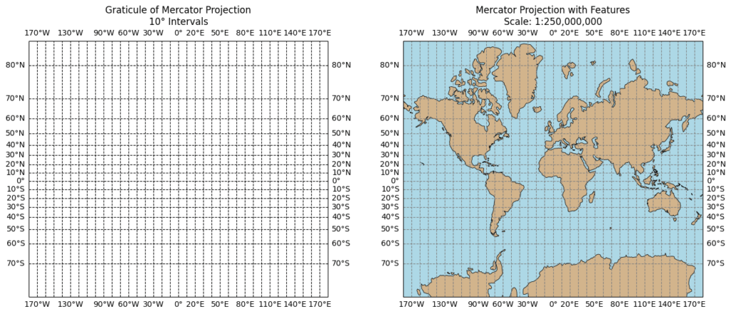
The Mercator projection is a cylindrical map projection developed by Gerardus Mercator in 1569. It's known for preserving angles, making it useful for navigation, but it significantly distorts the size of landmasses, especially at higher latitudes.
- The Geometry:
- Imagine wrapping a cylinder around the Earth, touching it at the equator.
- The projection maps points from the sphere onto this cylinder along lines radiating from the Earth's center.
- The cylinder is then "unrolled" into a flat plane, creating the Mercator map.
- Mathematical Formulas:
- Latitude (φ) and Longitude (λ): These are the spherical coordinates used to define points on the Earth.
- Transformed Coordinates (x, y): The projection transforms these into planar coordinates (x, y) on the map.
- Key Equations: The core equations involve the tangent and secant of the latitude, and are related to the natural logarithm.
- x = λ (Longitude)
- y = ln|tan(φ/2 + π/4)| (also expressed as ln|sec(φ) + tan(φ)| )
Here's a more detailed explanation:
Key Features:
-
Cylindrical Projection:
The Earth is conceptually projected onto a cylinder that touches the globe at the equator. -
Conformal:
It preserves angles locally, meaning shapes of small areas are accurately represented. -
Rhumb Lines as Straight Lines:
A crucial feature for navigation, rhumb lines (lines of constant compass bearing) appear as straight lines on the map. -
Distortion at Higher Latitudes:
The further from the equator, the greater the distortion in size, with landmasses appearing much larger than they are in reality.
Strengths:
-
Navigation: The projection's ability to maintain angles and show rhumb lines as straight lines made it invaluable for sailors.
-
Local Shape Preservation: Small areas on the map accurately represent their true shape.
Weaknesses:
-
Size Distortion:
The most significant drawback is the distortion of landmass sizes, particularly near the poles. Greenland, for example, appears much larger than it is, and countries near the equator are compressed. -
Not Ideal for World Maps:
Due to size distortion, it's not the best choice for maps where accurate area representation is critical.
Examples of Distortion:
-
Greenland appears larger than Africa, even though Africa is much larger in reality.
-
Antarctica appears as a massive continent, while it is significantly smaller.
In essence, the Mercator projection is a trade-off. It excels at preserving angles and representing rhumb lines as straight lines, making it ideal for navigation. However, it sacrifices accurate size representation, particularly at higher latitudes, which is a major drawback for general-purpose world maps.